
Anytime we consume foods or drinks, there is a secret recipe behind the scenes which contributed to the meal. Spices, herbs, or seasoning played a part in cooking the meal, so why not learn more about these flavorful ingredients?
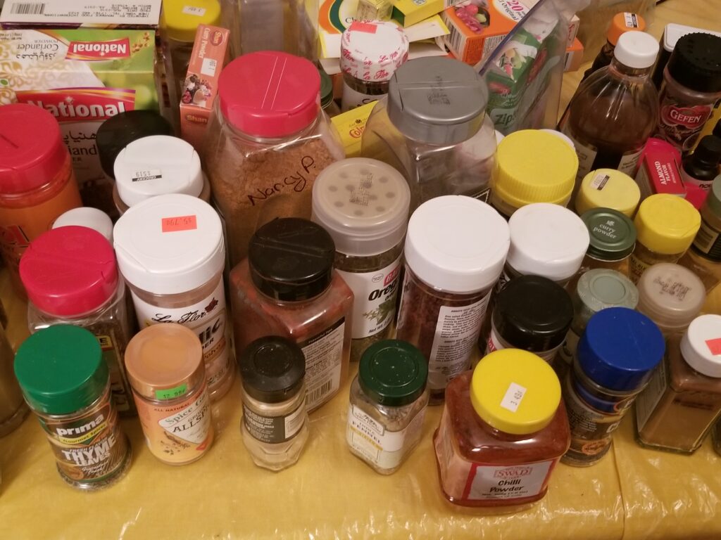
For the past two months, my mother has been begging me to clean out the spice cabinet because it has been difficult to locate spices when we need them. At one point, I had to remove most of the items from the shelf in order to locate my bottle of interest. Any person who cooks as frequently as we do has this quandary, but instead of lamenting this shortcoming, I am choosing to turn this struggle into a labor of love. It is important for anyone who cooks to have a sense which spices and items they own, as well as how often they are used. This can help with preparing for future shopping lists, especially given that we are in the second wave of COVID. In short, I am curious about the way my family uses spices, and whether we use spices associated with numerous cultures.
In my visualizations, I plan to answer the following questions: Which spices appear the most frequently in my kitchen cabinet? Which spices are used the most frequently? Is there a dominant spice color? Is there a single manufacturer for the spices? Are there spices with an expiration date prior to 2019? Which cultures have the most connection to the spices? All the data came from the spice shelves within my kitchen cabinet. It was collected in three Excel spreadsheets, then visualized using Tableau. The first table summarized spices descriptors, the second showed the cultures associated with the spices, and the third listed latitude and longitude coordinates along with the culture association. As a result, I will be able to practice joining three tables in Tableau.
To answer these questions, I created four dashboards, then compiled them into a story board with instructions and questions on the tabs. A storyboard was crucial since there are several visualizations and I wouldn’t be able to display al of them on the same page. Also, each visualization reveals a different part of the story; for this reason, I felt it was necessary to separate them. I want the story board to proceed from general to specific summarizations.
The first dashboard contains a tree map which outlines the spice inventory. My goal with this chart was to display “parts of a whole,” while demonstrating the disparity in the number of bottles owned. In the second dashboard is a bar graph and a symbol plot. The bar graph displays all the spice manufacturers for the bottles I own; the purpose of this chart was to display the comparisons between the manufacturer and the number of bottles that fit into that category. I placed the bars in descending order because I want the audience to focus on the length of each bar, and note the disparities. As for the symbol plot, I wanted a simple way to visualize the most dominant spice color, with less emphasis on the small differences between some circles. In the third dashboard are two bar graphs. The first is a stacked bar chart, which informs us of the variety of expiration dates, and whether items from a specific year were thrown out. I threw out most bottles which were more than 2 years expired, and wanted to communicate this in a simple graph. The second graph visualizes the spices which appeared the most frequently in my cabinet, along with their usage frequency. I wanted to examine whether there was a correlation between the spices I own the most, and their usage frequency. It seems that there is no direct relationship; having more spice bottles doesn’t necessarily mean I use them more frequently. In the final dashboard is a map for select spice origins. Most of the spices I use originate from four continents, and tend to come from India and Greece. I want the map to be a fun history lesson, so people can realize that we’re all connected.
These visualizations take into account powdered substances only; as a result, there is a plethora of seasonings not represented. I believe I can further enhance this project by examining EVERYTHING in my kitchen, including oils, sauces, fruits, vegetables and refrigerated items. This would certainly involve a lot more manual labor, but I believe with more work, I’ll be able to identify more countries of origin for the food I consume.

This entry is licensed under a Creative Commons Attribution-NonCommercial-ShareAlike 4.0 International license.