Tennis fans are fortunate to have three active male players being considered for the prestigious title of Greatest Player of all Time (GOAT). Two of these players, Rafael Nadal (currently ranked #2 in the world) and Novak Djokovic (currently ranked #1) faced each other in a Grand Slam championship match this past October, where Nadal won easily, and many fans considered it to be one-sided. I was not shocked with the end result, but rather with the mismatch between the players throughout the match, which led me to ask “why did this happen? And “what factors (if any) contributed to Djokovic’s loss?”
Through a head-to-head analysis between Nadal and Djokovic, I plan to answer the following questions: Which player has the most wins? Are there factors which contributed to a player’s win? The factors I’m considering are: court surface (hard court, grass or clay), court location (indoor or outdoor), weather (temperature, humidity and weather forecast), previous round match duration and the number of sets played in the previous round. I’m interested in these metrics as an avid tennis fan, and will not imply causation when analyzing the end result. My primary target audience would be tennis fans, but I want to include tennis novices as well. I would engage tennis novices by including explanatory annotations about how the game is played throughout my visualizations, and providing historical context when necessary.
All the data will come from the Association of Tennis Professionals (ATP), Roland Garros, Time and Date, World Weather Online, ATP Cup and Davis Cup websites. The ATP represents male tennis players, as opposed to the Women’s Tennis Association (WTA) for female players. Roland Garros, ATP Cup and Davis Cup are tournaments held annually, while Time and Date and World Weather Online include historical weather data. The ATP includes all the major tennis related metrics I’m interested in analyzing on their head-to-head profile pages for each player. To answer these questions, I created a story within Tableau, with each tab dedicated to a dashboard. The first tab provides historical context on the rivalry, while the second page discusses Grand Slam performances and the overallhead-to-head matchup. The third tab explores court surface, court location and a victory breakdown by round. The fourth page incorporates weather, while the last page discusses time spent on court in the previous match.
Anytime we consume foods or drinks, there is a secret recipe behind the scenes which contributed to the meal. Spices, herbs, or seasoning played a part in cooking the meal, so why not learn more about these flavorful ingredients?
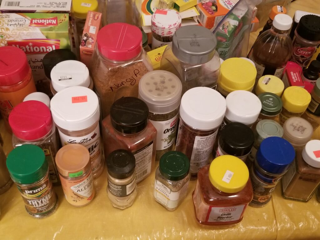
For the past two months, my mother has been begging me to clean out the spice cabinet because it has been difficult to locate spices when we need them. At one point, I had to remove most of the items from the shelf in order to locate my bottle of interest. Any person who cooks as frequently as we do has this quandary, but instead of lamenting this shortcoming, I am choosing to turn this struggle into a labor of love. It is important for anyone who cooks to have a sense which spices and items they own, as well as how often they are used. This can help with preparing for future shopping lists, especially given that we are in the second wave of COVID. In short, I am curious about the way my family uses spices, and whether we use spices associated with numerous cultures.
In my visualizations, I plan to answer the following questions: Which spices appear the most frequently in my kitchen cabinet? Which spices are used the most frequently? Is there a dominant spice color? Is there a single manufacturer for the spices? Are there spices with an expiration date prior to 2019? Which cultures have the most connection to the spices? All the data came from the spice shelves within my kitchen cabinet. It was collected in three Excel spreadsheets, then visualized using Tableau. The first table summarized spices descriptors, the second showed the cultures associated with the spices, and the third listed latitude and longitude coordinates along with the culture association. As a result, I will be able to practice joining three tables in Tableau.
To answer these questions, I created four dashboards, then compiled them into a story board with instructions and questions on the tabs. A storyboard was crucial since there are several visualizations and I wouldn’t be able to display al of them on the same page. Also, each visualization reveals a different part of the story; for this reason, I felt it was necessary to separate them. I want the story board to proceed from general to specific summarizations.
The first dashboard contains a tree map which outlines the spice inventory. My goal with this chart was to display “parts of a whole,” while demonstrating the disparity in the number of bottles owned. In the second dashboard is a bar graph and a symbol plot. The bar graph displays all the spice manufacturers for the bottles I own; the purpose of this chart was to display the comparisons between the manufacturer and the number of bottles that fit into that category. I placed the bars in descending order because I want the audience to focus on the length of each bar, and note the disparities. As for the symbol plot, I wanted a simple way to visualize the most dominant spice color, with less emphasis on the small differences between some circles. In the third dashboard are two bar graphs. The first is a stacked bar chart, which informs us of the variety of expiration dates, and whether items from a specific year were thrown out. I threw out most bottles which were more than 2 years expired, and wanted to communicate this in a simple graph. The second graph visualizes the spices which appeared the most frequently in my cabinet, along with their usage frequency. I wanted to examine whether there was a correlation between the spices I own the most, and their usage frequency. It seems that there is no direct relationship; having more spice bottles doesn’t necessarily mean I use them more frequently. In the final dashboard is a map for select spice origins. Most of the spices I use originate from four continents, and tend to come from India and Greece. I want the map to be a fun history lesson, so people can realize that we’re all connected.
These visualizations take into account powdered substances only; as a result, there is a plethora of seasonings not represented. I believe I can further enhance this project by examining EVERYTHING in my kitchen, including oils, sauces, fruits, vegetables and refrigerated items. This would certainly involve a lot more manual labor, but I believe with more work, I’ll be able to identify more countries of origin for the food I consume.
NYC311 is a service which allows New Yorkers to file complaints efficiently, and enables City agencies to better assist New Yorkers with their concerns. Since its induction in 2003, it is easier than ever to file a complaint, and as a result, New Yorkers are able to interact with City agencies in unprecedented ways.
As a native Brooklynite, I want to become active in my community, and be more proactive in instituting change for the greater good. NYC311 has empowered me to do both over the past couple of years. In addition, there is data available for NYC311 service requests from 2010 to present day, via the NYC Open Data Portal. It is important to note some complaint types have a descriptor, which provide further description of the incident. For instance, the complaint type residential noise has four descriptors: banging/pounding, loud music/party, loud television, and loud talking. When investigating the data, there is a plethora of complaint types to choose, but in light of recent events, I investigated residential noise complaints in Brooklyn, from January 1, 2019 to September 27, 2020.
In late September, my neighbors held a wedding in the hallway of our apartment building, with loud music and cheering, no social distancing or masks. Enraged, I contacted 311, and despite the fast response from the NYPD, I couldn’t help but wonder if any fellow Brooklynites had similar experiences. Therefore, I decided to channel my frustration into this project.
Tracking residential noise is crucial, especially in the age COVID. With the stay at home order this past spring, along with a select number of people working from home, more people are staying home than ever. It is important for the NYPD, tenant associations, building owners/managers and landlords to understand residential noise complaints so they can educate people on proper conduct, and direct resources to those in need. And for New Yorkers, it is helpful for them to know where the most residential noise occurs in Brooklyn, especially with so many people moving nowadays. The Mayor’s Office recently created MEND NYC, a free mediation service to alleviate disputes between bars, restaurants, and nightlife establishments, along with their neighbors. Similar services can be utilized with regards to residential noise complaints, with the proper data representation.
In my visualizations, I plan to answer the following questions: Did 2019 or 2020 have more residential noise complaints in Brooklyn? Which month had the most residential noise complaints? Which residential noise complaint type descriptor(s) had the most aggregated complaints from 2019-2020? What are the top 10 zip codes in Brooklyn with the most aggregated residential noise complaints from 2019-2020? In the top ten zip codes, what are the top residential noise complaint type descriptors?
To answer these questions, I decided to display four visualizations in a dashboard, in order to have continuity, especially for the last two charts. The first chart is a line graph of the total residential noise complaints in Brooklyn, categorized by month, for 2019 and 2020. Each line was assigned a different color in order to distinguish 2019 from 2020. As a result, I was able to answer which month and year had the most residential noise complaints. The second graph is a pie chart categorized by residential noise complaint descriptors. Each wedge illustrates the descriptor, along with its percentage of total residential noise complaints. This display allowed me to answer which type of residential noise complaints was most common from 2019 to 2020. The third graph is a bar chart of the top ten zip codes with the most residential noise complaints. Each bar is color coded according to year. In addition, I organized the bars in descending order to emphasize the disparity in some of the zip codes. As a result, the top zip code with complaints is on the extreme left. This proved to be useful for the last graph, which is a pie chart filtered by the top ten zip codes. The user can use the filter menu to filter by each zip code individually or collectively. In addition, each wedge displays the descriptor, along with its percentage of total residential noise complaints for that zip code(s). Therefore, I was able to answer which residential noise complaints are common in the ten zip codes with the highest number of complaints.
A dashboard is crucial for these visualizations because they are interconnected, and it may be difficult to understand the last pie chart if one can’t recall the penultimate graph. By placing the visualizations alongside each other, it is easier to see how they are interlaced. Ideally, viewers should read the visualizations following a “Z” shape, starting with the upper left-hand corner. Therefore, the audience can see the most general graph first, and end with the most specific graph.
Although these visualizations answer where and when the most residential noise occurred, they don’t answer why they are happening. I would like to further pursue this project by exploring the population sizes, along with the household types in the top ten zip codes. I believe both these factors may contribute to those zip codes with a higher number of residential noise complaints. As a result, I would use the US Census dataset, and join it with the 311 dataset for further analysis.
A Tableau visualization of the UN populations from 1985 to 2015. The filter option allows a user to observe the population in each continent from 1950 to 2015.
Need help with the Commons?
Email us at [email protected] so we can respond to your questions and requests. Please email from your CUNY email address if possible. Or visit our help site for more information: